

Enamor your old work

Being able to self-critique and not self-criticize, is very important to grow; but…
When we look at our old work, more often than not, we cringe at the sight of something we thought was GREAT work. That is good, and that means we’ve grown our practice and learned many valuable lessons along the way, thanks to that same work we now consider NOT SO GREAT.
Every NOT SUCH GREAT work leads to GREAT WORK!
I started my lettering journey with a passion project called ArtWord of the Week. It is a collection of uncommon English words that I illustrated. Over the course of 2 years, I illustrated 70 words, but 60 made the final cut into the project. It’s been now 3 years since I finished it, and it is still one of the best things I’ve done. There are so much that I’m proud of when it comes to this project:
My perseverance; the fact that I committed to it and endured for 2 years working on words every week, despite all other work & life obligations that I had.
The idea for the project; to this day I think this is a unique idea, and I haven’t seen a similar project out there. It gave me a lot of content and a lot of possibilities to explore creatively. I was hoping that it will catch more wind, but I guess it was a bit too nerdy for a larger audience (oh well).
Skills I’ve acquired; it started as a weekly project because I needed a full week for one word. By the end of it, I was able to do it over the weekend, working just a few hours on Saturday and Sunday.
Today I often go to this project for inspiration when working on new art. I also use it as a lookbook for clients to give me direction. Naturally, after three years I see imperfections in a lot of words, but I promised myself that I would not redesign any of the words, out of respect for this project and for my younger-creative-self.
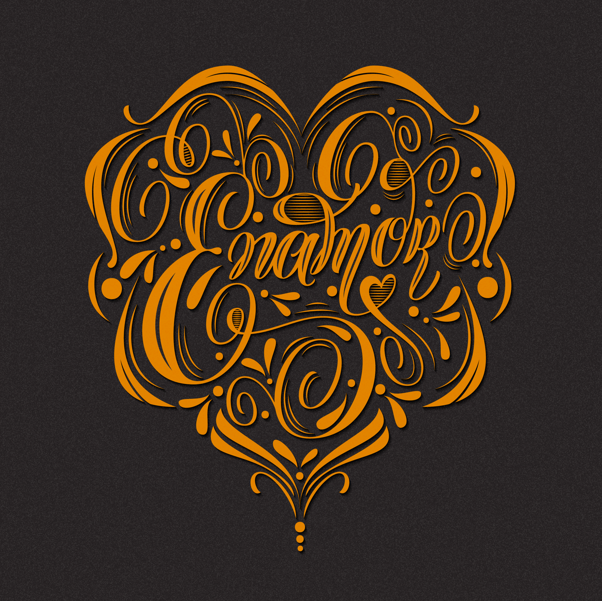
However, there is one word that I illustrated in week 25, ENOMOR, that I still love conceptually, but the execution can be better now that I improved my skills. So for educational purposes, I decided to redesign it. The original artwork will still remain in the project.

Original artwork
Respect your younger-creative-self; take lessons learn and leave the original work be.

I imported the old sketch to my iPad and started drawing on top of it.
I added the volume to the letters and gave them more movement and dynamic. Since it’s a heart-shaped composition, a certain level of symmetry is needed. But some parts have to be asymmetrical. By adding extra decorative elements, I can turn that asymmetry into optical symmetry.
Also, I felt that the original artwork has a lot of white space. Adding subtle decorations would give it more volume and tension.
That was enough for me to take it into Illustrator and start working on the final art.
One of the most important things I needed to achieve was to stay true to the original artwork as much as possible. I liked the composition and the flourishing work, but those letterforms needed improvement.
Firstly I needed to increase thins to add more tension between letters, and to improve legibility. The letters look too scattered like they are floating in the air. They need a more streamlined placement. The letter E looks sad, almost like crying; I need to give it more life. And overall, the letters lack energy and dynamics.
I love the flourishing work I did here and will try to keep it as much as possible, but thins also need more volume.

In needs to look good in black & white, before it’s ready for colours & effects.

I often make a lot of adjustments directly in Illustrator, especially to the letterforms. That is one of the reasons I love vectors. It makes it easier for me to spot imperfections and fix them. No matter what medium I will use to produce the final art, I always create a vector version to polish artwork. Then I use that file as a template for paper cutting, mural painting, etc.
You can see here that I wasn’t happy with the letterforms I sketched out, so I decided to change them up a bit to create more energy and movement. I love when letterforms have the organic, handwritten look to them, especially script lettering. It gives a more authentic look to the letterforms as if they were handwritten, just better. I cleaned it up a bit, as well, to achieve a better balance between letters and decoration.
Once I was happy with all shapes, I added colour & effects to finalize the artwork.

Before

After
Few colour variations


Improvement?
Let me know what you think in the comments section. Thank you for reading!