

Creating a Personal Brand - Part 1
A personal brand needs to reflect everything from who you are, to what you do!
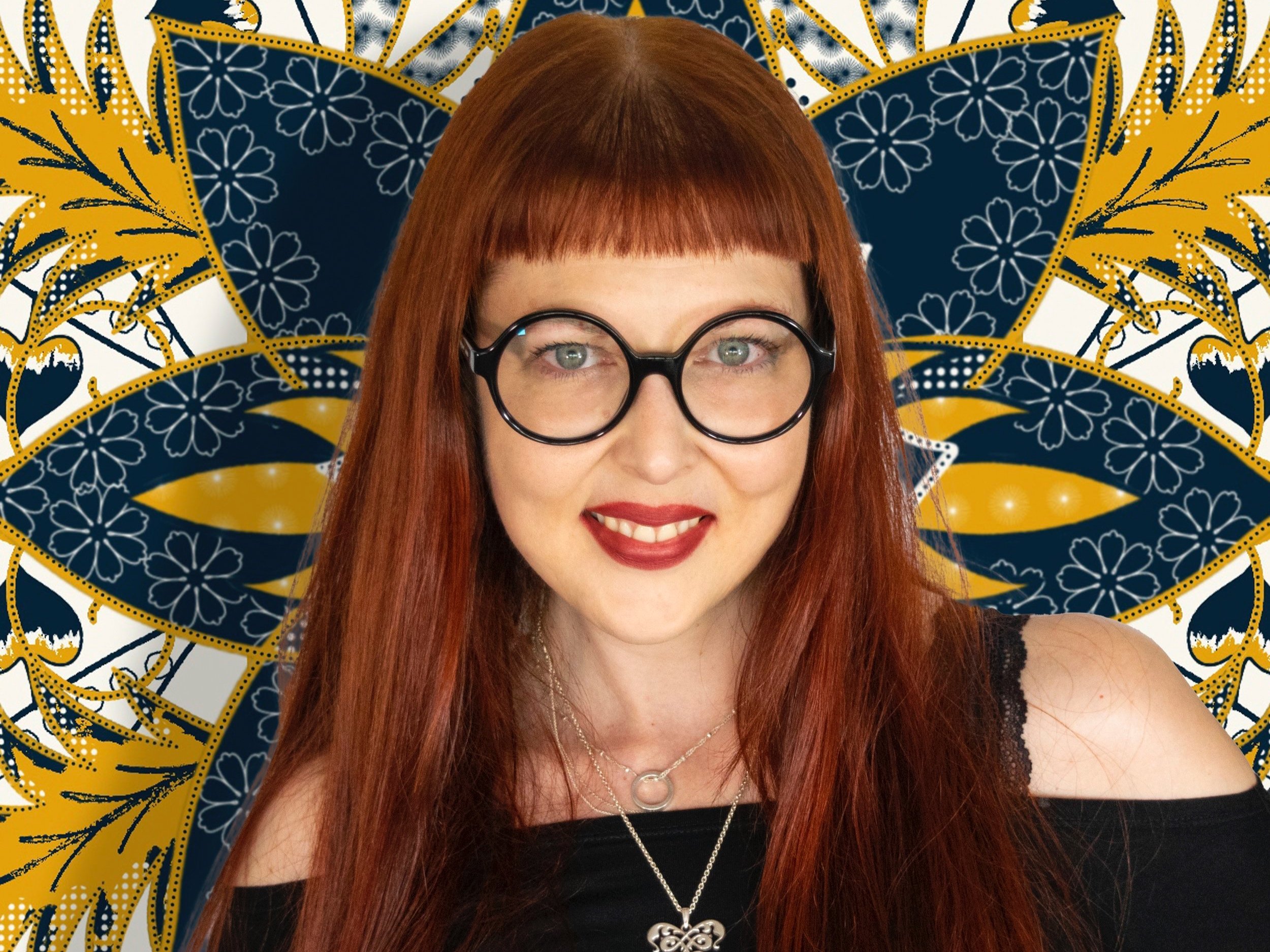
I recently spent a few weeks creating my personal brand, and it was harder than I thought it would be; it turns out that I was my toughest client thus far. Regardless, I had a great time working on my brand and wanted to share the process with you.
It started with a few simple questions; Who am I? What I do? What are my core values? What I want the world to see?
When it comes to personal branding, as a lettering artist and a graphic designer, I felt that I need to do a great job. I have to make sure my brand reflects my personality, quality of my work, and it needs to be really well executed from a technical point. No pressure, right?
The best place to start was to look at my work. Even though it's my work, it was helpful to look at it from a general perspective vs. on a project base. I took note of overall aesthetics, repeating elements, colour scheme, and general tone.
The second step was to decide what are the brand assets that I want to create. Usually, brand assets for lettering artists are; logotype and/or icon. As a lettering artist, designing a logotype is advisable, it will give me credibility by showcasing my lettering & logotype design skills. But logotypes may not always be practical, especially with such a long name like mine. Therefore having a symbol can be a great asset, that will allow for more versatility in promoting my brand.
A brand symbol can be absolutely anything you want. It can be a letter, a monogram, an object, an abstract shape, etc. Choosing the direction required some thought. I love monograms, and for a lettering artist, they are just perfect. But my initials are VD, which is an official acronym for venereal disease. So that was out :D. But I still wanted a symbol that will be rooted in a letter. Therefore I chose to focus on just V.

By its nature, letter V is a simple letter. There is beauty in that simplicity, but I am not known for having a simple design style. I like it complicated. Therefore I started to play around with the shape, bend it and twirl it to see what I can come up with. I let my hand make all kinds of weird movements, and at the end, I liked the triple crossed shape; it reminded me of Victorian typographic ornaments. I liked this idea of having a symbol that can be tied to lettering or typography.
It was a good start, but it still didn’t tell a full story for my brand.
One of the most important values that I wanted my brand to show is love; love for the work I do, love for people I work with, love for the lettering community, and ultimately love for all people. When I think of love, there is only one symbol that comes to mind; a heart. Due to its ties with the romance, the heart symbol is not something I wanted for my brand, but looking at this triple crossed V really reminded me of a heart. All of a sudden I saw the symbol I wanted for my brand; a heart-shaped “V” rooted in victorian typography. I took this basic shape and started to add some character to it using elements that I often use in my work. Little by little a shape was starting to form and a symbol for my brand emerged.

The process was not smooth, and in a lot of ways I feel I got lucky, but that is what happens when you let the process show you the way. Instead of having a preconceived notion of what I wanted as a symbol for my business, I let the creative process to take me there, and I am very pleased with the end result.

In my next blog post, I will show the process of creating my logotype and choosing colours for my brand. This was another long process that deserves its own post.